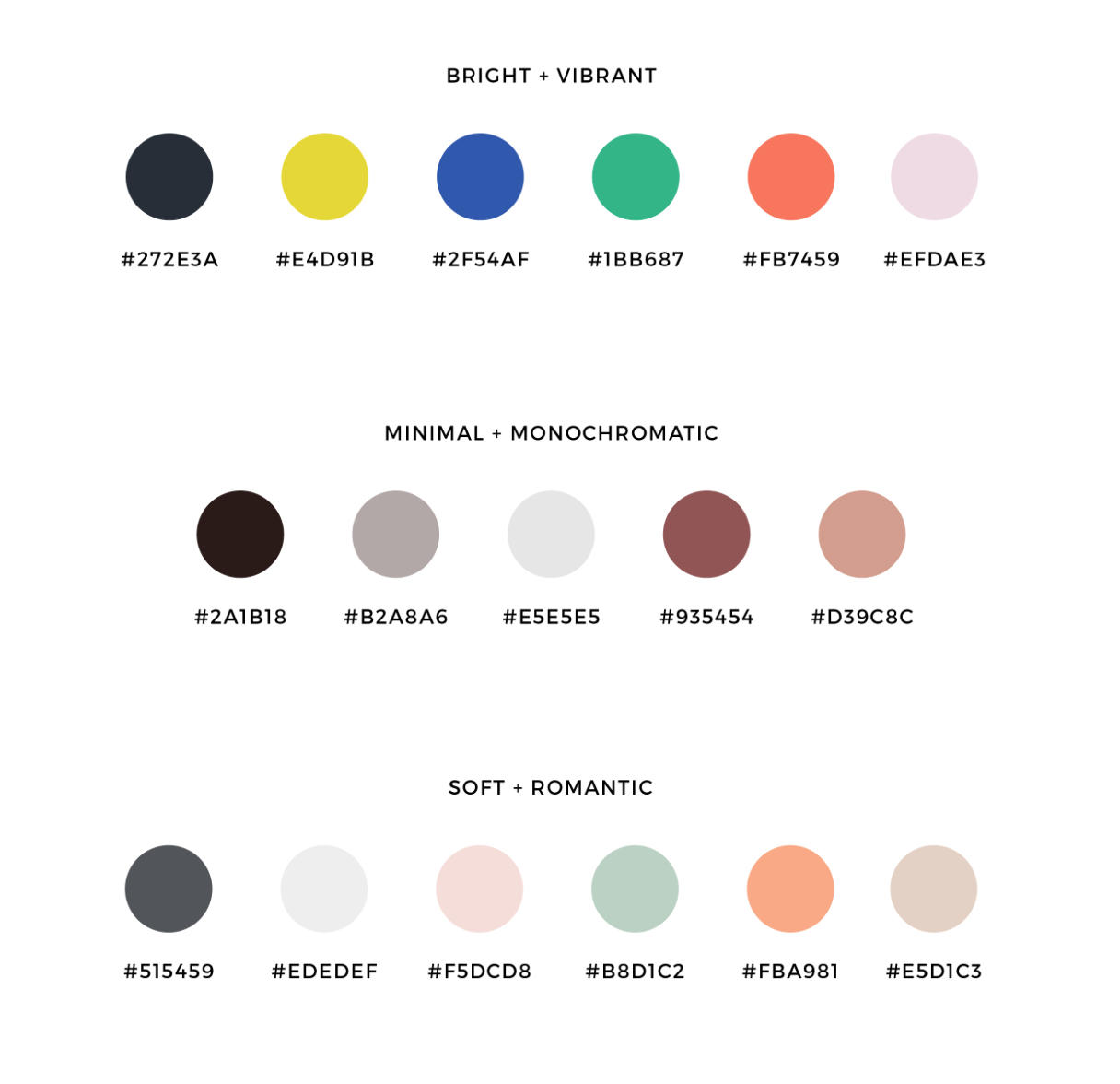
Putting your Branding palette together
There’s a couple tricks that can allow your colour palette to work well for your Business or Personal Brand.
It's best to keep your colour palette between 3-6 colours. This allows you to use a variety of shades and tints of each colour to allow more versatility.
Below is some inspiration for your branding palette:
1. Dark colour for text & accents
Ideally you'd have at least one dark color. This color will be used for most of your text and in contrast with the other colors you choose. Be sure to choose a color that is dark enough to allow your text to legible on a white or light background. This color can be pure black, dark grey, navy, or anything else you can come up with.
2. White backgrounds
The most common color people choose here is white. You can choose 1 or 2 light colors for backgrounds. I suggest sticking to white mostly as it is easier to work with and can be more visually appealing on your website.
3. Contrasting colours for accents and highlights
Contrast is your friend when it comes to choosing colors for your palette. You want to choose a color or colors that are contrasting with the rest of your palette to highlight and accent certain parts of your branding and website. I highly recommend choosing 2 contrasting colors so you have a variety to work with.
Don't worry about getting your color palette perfect the first time. It is not set in stone and you can always revise as you go along to see how it works for you and your brand.
To give you a head start with your color palette, use this template to create your own.
Image via Pinterest

